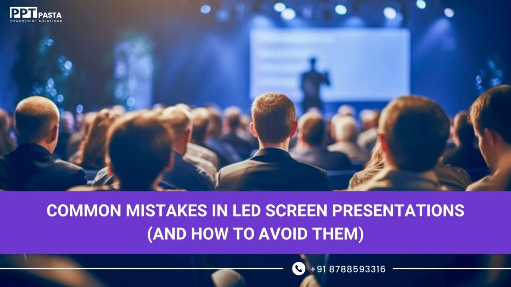
LED screens have become the backbone of modern corporate events. From annual conferences and sales meets to product launches and award nights, almost every large-scale event today runs on massive LED walls.
Yet most presentations shown on these screens still fail.
Not because the screens are bad.
But because the PPT was never designed for them.
In this blog, we break down the most common mistakes brands make in LED screen presentations, especially when using long ratio PPTs or wide screen presentation formats, and how to fix them.
Mistake 1: Using a Normal 16:9 PPT on LED Walls
This is the biggest and most expensive mistake.
Most people take a regular laptop PPT and stretch it onto:
- A 10m LED wall
- A curved screen
- A panoramic stage setup
Result:
- Content looks tiny
- Visuals lose impact
- Important information gets cut
- The screen feels empty despite its size
The Fix
For event screens, you need:
- Long ratio PPT
- Wide screen presentation design
- Custom aspect ratios based on actual LED dimensions
LED screens are not TVs.
They are visual stages. Your PPT must match the stage, not your laptop.
Mistake 2: Too Much Text for Event Screens
What works on a meeting slide completely fails on a big screen.
Common problems:
- Paragraphs instead of headlines
- Bullet points across the width
- Small font sizes
- Dense data tables
On LED walls, the audience is:
- Far away
- Distracted
- Watching speakers, not reading essays
The Fix
For PPT in event screen content:
- Use 1 idea per screen
- Headlines over paragraphs
- Visual storytelling instead of bullet points
- Design for readability from 10–30 feet
If it can’t be understood in 3 seconds, it doesn’t belong on stage.
Mistake 3: Ignoring Long Ratio Flow
A long screen presentation is not a poster.
It is a moving story.
Most brands treat long screens as:
- Static banners
- Oversized slides
- Random visuals stitched together
So the screen feels disconnected and boring.
The Fix
In a proper long ratio PPT:
- Content should flow horizontally
- Visuals should reveal, not jump
- Movement should guide the story
- Left-to-right becomes narrative direction
Think cinema, not slideshow.
Mistake 4: Poor Visual Hierarchy on Wide Screens
When everything is big, nothing feels important.
We often see:
- Logos fighting with headlines
- Multiple focal points
- No clear visual priority
- Content scattered across corners
On ultra-wide screens, hierarchy is everything.
The Fix
A strong wide screen presentation must:
- Have one dominant focal area
- Guide the eye intentionally
- Balance negative space
- Respect viewing distance
Design is not about filling space.
It’s about controlling attention.
Mistake 5: Not Designing for Camera & Hybrid Events
Modern events are no longer just physical.
They are:
- Live streamed
- Recorded
- Viewed on mobile
- Rewatched on YouTube or Teams
But most LED screen PPTs ignore camera framing completely.
So:
- Important content falls outside camera view
- Speakers block visuals
- Screens look great live but terrible on video
The Fix
Professional event screen content is designed for:
- Live audience
- Camera crop
- Speaker movement
- Hybrid viewing
Your PPT should work both on stage and on screen.
Mistake 6: Treating LED Screen Content Like Static Branding
Many brands use:
- Heavy brand guidelines
- Flat visuals
- No motion
- No transitions
On LED walls, this kills energy.
The Fix
For high-impact LED screen presentations:
- Use motion-led storytelling
- Build directional transitions
- Animate reveals
- Let content breathe and move
Static slides belong in boardrooms.
Event screens demand movement.
Mistake 7: Designing Without Knowing the Actual Screen Size
This one sounds basic.
Yet it happens constantly.
Designers create PPTs without knowing:
- Screen width in pixels
- Aspect ratio
- Curvature
- Number of LED panels
So on event day:
- Content overflows
- Margins collapse
- Safe zones disappear
The Fix
Every PPT for events should start with:
- Exact LED dimensions
- Viewing distance
- Camera framing
- Event flow
Design without screen data is guesswork.
And guesswork shows.
Why Long Ratio PPTs Perform Better for Events
When done right, long screen presentations:
- Feel cinematic
- Hold attention longer
- Look premium instantly
- Improve brand perception
- Enhance storytelling
They are not just bigger slides.
They are designed experiences.
Final Thought
If your presentation is going on:
- An LED wall
- A stage screen
- A panoramic display
- A hybrid event
And it was designed like a laptop PPT,
you are already losing impact.
Modern events require:
- Long ratio PPT
- Wide screen presentation design
- Purpose-built event screen content
Because when the screen gets bigger,
your mistakes become bigger too.
And so does your opportunity to stand out. 🎯